Tag Archives: Block Merchant

Last week I went to Taiwan to visit a bunch of old friends. I stayed at my buddy Jay's place and had the chance to see him try out my most recent game. In about 15 minutes, I got more useful feedback from that than I had from dozens of messages and emails from various people online.

When he first started, he skipped the instructions. That's pretty much what I'd expected. But he wasn't sure how to get gold in the game. The shop interface confused him due to the way I'd named things. Selecting Return took him to the main menu of the shop, instead of out of the shop as he'd hoped. The way selling worked was a surprise. In the end, he only had money to buy a couple of terrible pieces, with which he promptly lost. If not for the fact that he knew the maker of the game, he never would have tried it again.

Seeing someone repeatedly curse (or at least want to curse) the interface for something you've made is pretty enlightening. I knew exactly which spots were annoying. It didn't take long at all to rename Return into Leave. I also eliminated the hierarchical structure of the shop altogether and made a menu for all the options stay at the top at all times. This way users could browse the blocks for sale and then go directly to looking at the ones they already had without having to go back to a main menu first. Jay gave several other interface suggestions, some of which I've already implemented.

The other major problem I realized was that my game was way the heck too hard. This I also blame on doing almost all the playtesting myself. As I built the game, I became very familiar with its interface and with the strategies needed to do well. What felt easy to me was way to hard for anyone playing it for the first time. As I saw my friend play the game, I slowly came to the realization that there were things I'd included in the game, things that I'd worked hard on that nobody except myself ever saw. What's the point of creating a super powerful item that slows time in the game if nobody ever knows of its existance? I've heard that this is a common problem with playtesters who continue testing a game for too long-- they get a totally skewed idea about its level of difficulty.

As a result of seeing the game played, I now understand why the kongregate rating was so poor. I also have a clear path towards improving the experience. With that knowledge, I've decided not to work on my robots with lasers game idea yet. I'm going to improve Block Merchant. As far as I see it, the game wasn't done when I released it. Unfortunately, it's not really going to get much more feedback from kongregate users, but I can at least make it a better game. I think I'll budget myself 15 hours of work on it before I try putting it up on newgrounds or another site.

I put significantly more effort into Block Merchant than I did into the last game. The programming logic was more difficult; I didn't get it working properly until after thinking of a way of making a grid system. There was actual artwork, however simple involved. I also made made a shiny title screen composed of multiple alpha layers. I definitely learned a decent amount making it, but it wasn't well liked at all by the few people who played it on Kongregate. I got some feedback from them at least, but it is still a bit of a bummer. I think it's possible that the bar for free flash games is higher than it was six months ago. There are so many others such as myself who have followed various tutorials and started making games that the casual gamer's patience for familiar concepts is much less than it used to be.

I see two ways to go from here.

  1. Make improvements. It still won't make much of any revenue since it's not that novel. It will be much better liked after getting some polish, though. Also, it might be good for me to try to actually make something a bit higher quality.
  2. Make a new game. I'm thinking of programmable robots that you fight against each other. It would probably have more of a chance of gaining some traction. I'd also learn more from a new project than continued work on an old one.

My third full flash game is finally done! While my last one, Juggle Basher was essentially just a breakout clone, Block Merchant goes beyond the many tetris clones out there. It has different pieces, a new game mechanic of money and a shop which allows you to buy and sell blocks to optimize your set. The programming side of things was definitely a bit harder than the breakout clone, but where I really spent more time was the graphics. I probably put as much time into making the intro screen and the shop screen as into the programming. Fortunately, a fellow konger who goes by zoranac offered to help out with the music. He's been churning out all kinds of music in the Kongregate colabs.

As usual, I've put the game up on Kongregate and set it up to hook into their high scores api so your achievements will get recorded.
(more…)

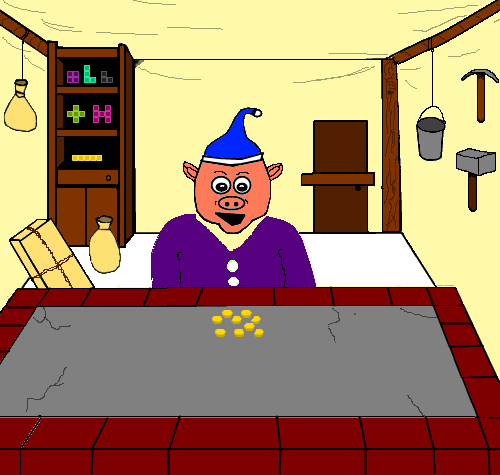
Making a shop background has been difficult for me. First of all, I lack the drawing skills. Given an hour or so, I can do a decent job at realistic sketches, but comic-style drawing is what matters for games. After many, many false starts, I got a mediocre shop sketch done. I put a (hopefully) greedy-looking pig merchant in the front, a bookcase with blocks in the back and various low-tech shop stuff in the background. After taking a picture of my drawing with a digital camera and uploading it to my computer I went to Aviary, a web-based art-suite. It's not as powerful as Photoshop, but it's no slouch and it doesn't cost hundreds of dollars, either. I used the vector app to create polygon-based shapes on top of my sketch. Here's what it looked like part way through:

After finishing, then I saved the file as a png, and opened it with Paint.net to do the coloring and the details that had to be drawn. This process took me forever. Part of the problem is that I was using a mouse instead of a tablet, but I think most of it was just various rookie errors. Never resize stuff before using the paintbucket tool. The shapes will leak! Also, There were some serious perspective errors. Erasing and re-drawing huge chunks of picture really sucked. Next time, I'll try a lot harder to get it right with the vector based shapes at the beginning. I'm not completely proud of the final project, but I think it's better for my learning to just finish it and then be able to work on the next project sooner.

As far as I know, rotation in all the classic block games such as Tetris or Blockout was done in about the same way-- by storing an array of values for each of a block's possible states. For example, a long block in Tetris would have been stored something like the following. In its default rotation, it's horizontal with the following coordinates: [0,1], [1,1], [2,1],[3,1]. In after rotating clockwise, it's vertical like this: [1,0], [1,1], [2,1], [3,1]. The other two rotations would just be mirrors of the first two, so the entire block data could be stored in a multi-dimensional array like this:

rotation = 0;
L = [
  [[0,1],[1,1],[2,1],[3,1]], 
  [[1,0],[1,1],[2,1],[3,1]], 
  [[0,2],[1,2],[2,2],[3,2]], 
  [[2,0],[2,1],[2,2],[2,3]]
];

Then the variable L[rotation] would return the coordinates of L in whatever rotation it happened to be in (in this case [0,1], [1,1], [2,1],[3,1]). Rotating blocks is very quick this way, but the downside is that rotational info has to be manually inputted for each block.

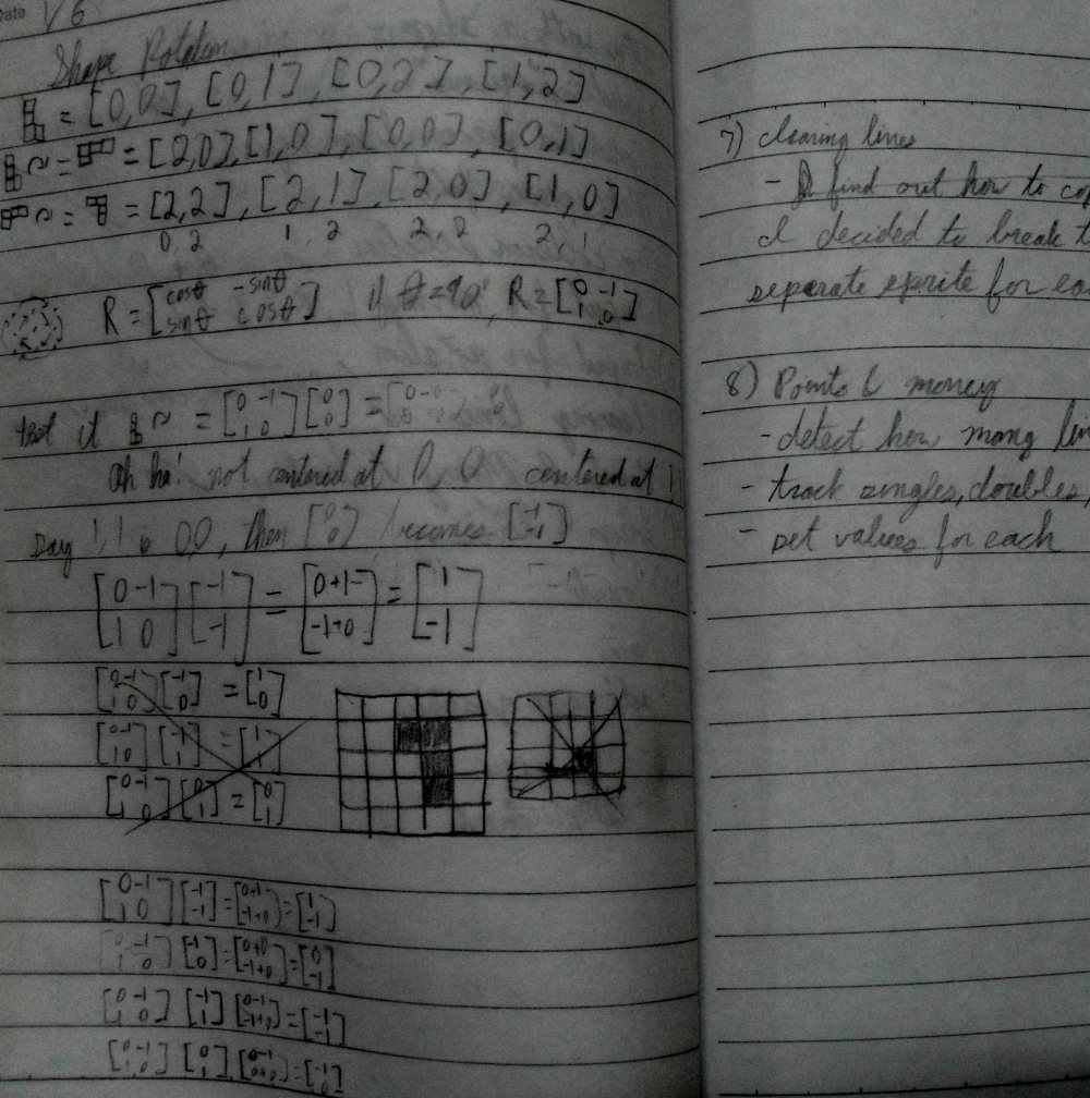
Since the block game I'm making isn't just a tetris clone, and I want to have a shop in in where players can buy or maybe even design their own blocks, I've decided not to use this method. Instead of entering everything in by hand, I'll use math and let the computer do the work of coming up with the transformations for each block. 2D rotations are a simple 2x2 matrix multiplication, and 90 degree rotations are even easier than that. This way, each time a piece is rotated, the locations of its constituent tiles will be updated by a matrix multiplications.


Problems

1) Matrix multiplication is very slow compared to an array lookup. I can live with this. It's not 1985 and there will only be one block being rotated at a time anyway.

2) Repeatedly rotating a piece can make it drift until the coordinates of its squares are hugely positive or negative and further rotations just make it orbit around a point instead of just rotating in place. This was really annoying. I fixed it by making the 2,2 location the "center" of each piece, subtracting [2,2] from each tile's coordinates before doing rotation multiplications and then adding [2,2] back to them after the rotations. This fixed the problem with a couple of caveats. Pieces have to be created such that rotating around their 2,2 point looks reasonable, and...

3) Some pieces should just stay in place when they rotate. A 2x2 square is a perfect example. Yes, I could just have it rotate around whichever of its four tiles happened to be at location 2,2. It would look stupid, though. The center of the visible part of the piece isn't on any of its constituent tiles, it's between them. I solved this problem by allowing a property to the block class to state that rotations should do nothing. I'm not 100% satisfied with this, but off the top of my head I can't think of any pieces that must transform when rotating and yet would look bad rotating around one of their constituent tiles.

Here's my rotation function for my block class. Note that shape is an array in the block class that holds the locations of a block's tiles:

function rotate():Array {
  var xoff:int = 2; // every block will rotate around 2,2
  var yoff:int = 2;
  if (rotatable == false) return shape; //rotation doesn't change this shape

  var newshape:Array = new Array;

  for (var coord in shape) { //use 90 degree matrix rotation [0 -1]
                               //                              [1  0]
    newshape[coord] = new Array;
    newshape[coord][0] = (shape[coord][1] - xoff) * -1 + xoff;
    newshape[coord][1] = shape[coord][0];
  }
  return newshape;
}

I ran into some problems with handling the block sprites. I was basically just using the same built-in .x and .y properties built into flash sprites and adding some number to currentBlock.y in the event loop for gravity, and either adding or subtracting from currentBlock.x when a direction arrow was pressed. The problem with this was that it made collision detection a pain, and it also raised questions like what to do with a block partway between two square locations. In a game like Tetris or Blockout, the squares of the playing pieces have to fit into the squares on the board.

The way I decided to fix it was this-- give the block class getters and setters for x,y coordinates in terms of the grid of the playing area, not in terms of pixels on the screen. I made all animation in discrete 1 square increments and this also made collision detection much easier. Here's the top of my block class:

public class Block extends Sprite {
  static const size:int = Board.gridSize; //size of the board's "squares"
  static var list:Array = []; // for keeping track of all the blocks

  var edge_color:int;
  var inner_color:int;
  var shape:Array;
  var type:String;
  var _gy:int; // the y position in grid squares rather than pixels
  var _gx:int; // the x position in grid squares rather than pixels
  var _gwidth:int;
  var _gheight:int;

And the getters and setters for the grid variables:

function get gy():int {
  return ((this.y-Board.top)/ size);
}
function set gy(gy:int):void {
  this.y = gy * size + Board.top;
}
function get gx():int {
  return ((this.x)/ size);
}
function set gx(gx:int):void {
  this.x = gx * size;
}

With the convenience of these getters and setters, along with a few others for width and height of pieces in terms of grid squares, it made animation very easy. I didn't need to refer to x,y screen coordinates again in the block class and could just increment or decrement currentBlock.gx or currentBlock.gy by one to move a block one square. Collision detection was similarly simplified. Instead of needing to use hitTestObject() as I did in the other two games I've made, all that was necessary was 2 dimensional array of the playing grid, filled with zeros for empty locations and ones for locations with a block. Then, before moving a piece, I just check to see which grid locations the piece would occupy and not allow the move if they're occupied. For example, If I had a long thin piece occupying squares (5,4), (5,5), (5,6), and (5,7) then all I'd have to do is check (6,4), (6,5), (6,6) and (6,7). If all of them are unoccupied then I can increment currentBlock.gy and move the piece. Moving left, I'd check (4,4), (4,5), (4,6) and (4,7).

In retrospect it seems obvious that a grid representation would be the way to go for a game with pieces and a playing field broken up into discrete squares (or cubes for blockout), but it wasn't the first idea I had.